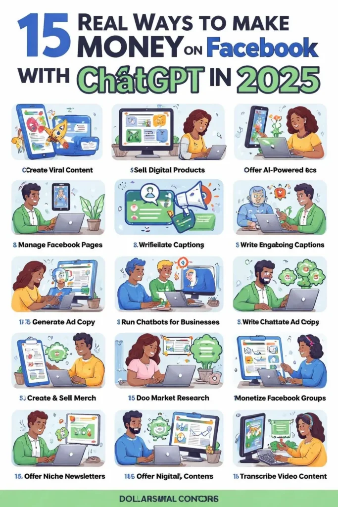
 11
11
The typeface embedded within an AI sales assistant is a silent yet powerful component of user experience, directly influencing engagement, trust, and conversion rates. It is not merely a design choice but a functional element that shapes how information is perceived and processed during critical sales interactions. Evaluating this typography requires moving beyond subjective aesthetics to assess its alignment with brand voice, technical performance, and accessibility standards. A well-chosen typeface ensures the AI’s communication feels both human-like and professional, reducing cognitive load and fostering a sense of reliability.
Legibility and readability form the foundational criteria for evaluation. The font must be exceptionally clear at various sizes, from mobile notifications to desktop dashboards, without causing eye strain. This means examining x-height, character spacing, and stroke contrast. For instance, a typeface with overly condensed letters or delicate serifs may render poorly on low-resolution screens or small device displays, leading to misread prompts or commands. Test the assistant’s interface in real-world scenarios: can a user quickly scan a suggested email draft or a lead qualification summary without squinting? The goal is frictionless comprehension, especially when the AI is delivering time-sensitive data like meeting summaries or objection responses.
Beyond basic clarity, the typeface must embody the brand’s personality and market positioning. A fintech company’s AI assistant should convey stability and precision, often achieved through a clean, geometric sans-serif like Inter or a robust custom typeface. Conversely, a creative agency’s tool might leverage a more expressive, humanist font to signal innovation. The chosen typeface should be consistent across all touchpoints—from the assistant’s chat bubble to exported reports—reinforcing brand recognition. Inconsistency, such as a playful font in chat but a sterile one in PDFs, creates a disjointed experience that undermines the polished, integrated feel marketing automation promises.
Technical scalability is a critical, often overlooked aspect. The typeface must perform flawlessly across web, mobile apps, and even in email client renderings. Variable font technology, now standard in 2026, allows for a single font file to dynamically adjust weight, width, and slant. This is invaluable for responsive design, ensuring the AI’s text adapts smoothly to any container size without layout shifts. Evaluate whether the marketing automation provider uses variable fonts efficiently or relies on multiple static font files, which increase page load times—a direct hit to user engagement and SEO. A slow-loading chat widget with janky text rendering will see users abandon the interaction before the AI can even assist.
Accessibility compliance is non-negotiable. The typeface selection must meet WCAG 2.2 AA standards at minimum, ensuring sufficient color contrast ratios against the background and offering sufficient character differentiation for users with dyslexia or visual impairments. Look for providers who explicitly document their accessibility testing. Features like generous line height (leading) and open counters (the enclosed spaces in letters like ‘a’ or ‘e’) significantly improve readability for a broader audience. An AI assistant that excludes users due to poor typographic choices not only risks legal repercussions but also forfeits potential leads, directly contradicting the inclusive goals of modern marketing.
The emotional resonance of a typeface subtly guides user sentiment during sales conversations. A warm, rounded sans-serif can make an AI feel more approachable during initial lead nurturing, while a sharper, more neutral font may be preferable for contract negotiations or data-heavy analytics. The best marketing automation platforms allow for some customization within their typeface system, letting businesses tweak weight or style to match the context of different sales stages. For example, a softer weight might be used for empathetic responses to customer objections, while a bolder weight highlights key action items in a summary. This contextual typography, though subtle, enhances the perceived intelligence and empathy of the AI.
Practically, evaluation involves hands-on testing and vendor inquiry. Request a sandbox environment and test the assistant’s interface under various conditions: different browsers, devices, and operating systems. Check how the typeface renders when the AI generates long-form content, like a blog post idea or a campaign brief. Ask the vendor directly about their font licensing—ensuring it covers all desired usage scenarios without unexpected costs—and their roadmap for typography updates. A provider committed to evolving their design system will likely offer better long-term value as display technologies and user expectations shift.
Furthermore, consider the typeface’s integration with the AI’s voice and language model. Does the font’s personality clash with the conversational tone? A formal, traditional font paired with a casually worded AI response creates cognitive dissonance. The typography should harmonize with the linguistic style, whether that’s professional, conversational, or enthusiastic. This holistic alignment makes the AI’s presence feel intentional and well-designed, rather than a bolted-on feature. Companies like Salesforce and HubSpot have invested heavily in cohesive design systems where typography, iconography, and language work in concert, setting a benchmark for the industry.
Finally, the business impact of typography in an AI sales assistant ties directly to performance metrics. Poor readability increases task completion time and error rates in data entry. An unappealing or untrustworthy typeface can decrease user adoption of the tool by sales teams, who may perceive it as a low-quality utility. Conversely, a thoughtfully selected and expertly implemented typeface contributes to higher user satisfaction, better comprehension of AI-generated insights, and ultimately, more effective sales motions. It is a component of user experience that, while silent, speaks volumes about a company’s commitment to quality and detail. Evaluating it rigorously is not a design-centric luxury but a strategic imperative for any business leveraging AI in its revenue operations.